Preparing High-Resolution Digital Files for Large-Scale Commercial Wall Printing and Branding Projects
Introduction: The Evolution of Interior Branding via Direct-to-Wall Printing
Interior branding has moved from vinyl wraps and weeks-long paint cycles to large scale wall printing executed directly on finished surfaces. This shift is driven by the need for speed, lifecycle efficiency, and seamless visuals that feel integrated with the architecture. For facilities teams and brand leaders, the ability to update commercial interior branding graphics in hours—not days—changes how campuses, hospitals, workplaces, and retail fleets plan refreshes.
With on-site direct to wall printing, technicians produce HD imagery on drywall, concrete, CMU, or brick without adhesives or panels. There are no seams to trap dirt or bubble, and no shipping delays or panel mismatches. Results are photoreal, cleanable, and paint-over-ready, making them ideal for high-traffic corridors, patient areas, K–12 wayfinding, and lobby-scale storytelling. Because printing happens after other trades are finished, schedules are simpler and occupied buildings remain open.
This production method also reframes how creative teams prepare files. Instead of tiling for panels, teams focus on resilient mural file specifications: vector artwork where possible, and large raster files sized to final dimensions with appropriate viewing-distance DPI. Preflight steps include surface surveys, color management profiles, and test swatches to ensure high resolution wall graphics reproduce brand colors and fine detail at architectural scale. It’s a natural fit for digital art for murals, allowing illustrators and 3D artists to scale compositions reliably across multi-wall environments.
Why teams are making the switch:
Installations often complete in under five hours with minimal disruption.
Seam-free outputs reduce failure points, maintenance, and replacement cycles.
On-site production eliminates shipping delays and fabrication errors.
Consistent, repeatable execution supports multi-location and national rollouts.
Materials and methods are more sustainable than vinyl wall coverings and wallpaper.
Integrated wayfinding, safety, and instructional graphics reduce signage clutter.
EastCoast MuralPros operationalizes these gains with next-generation direct to wall printing technology. The team supports prepress, file optimization, and campus-wide planning, and can complete many installations in under five hours with minimal disruption. For organizations evaluating alternatives to vinyl and wallpaper, EastCoast MuralPros offers predictable execution at scale—including subscription refresh programs and in-studio printing for doors, tables, and standees that complement wall systems.
Understanding Resolution and DPI Requirements for Architectural Scale
At architectural scale, resolution is about effective pixels per inch (PPI) at the installed size and typical viewing distance—not the printer’s dots per inch (DPI). For large scale wall printing, the goal is to supply enough detail for the closest expected viewer while avoiding oversized files that slow production. Surface texture matters too: drywall can show more micro-detail than brick or CMU, so rougher substrates require slightly less PPI to look crisp in context with direct to wall printing.
Use viewing-distance targets to set practical mural file specifications. These ranges cover most commercial interior branding graphics and wayfinding:
3–6 ft viewing (corridors, patient rooms, classrooms): 120–150 PPI at final size
6–10 ft viewing (lobbies, conference rooms, retail walls): 100–120 PPI at final size
10–25 ft viewing (atriums, long sightlines): 60–100 PPI at final size
Rough/porous surfaces (brick, concrete, textured CMU): aim for the lower end of each range
Calculate resolution from the wall dimensions. Example: a 20 ft × 8 ft wall is 240 in × 96 in. At 120 PPI, a raster image should be about 28,800 × 11,520 px. That’s a large file, so favor vector art for logos, type, and linework (infinite scalability), and reserve high-resolution raster only for photos or renders. If your source photography is smaller, upscale carefully (e.g., Photoshop Super Resolution) and sharpen to taste, watching for halos and banding.
Set up files with the final print size in mind to keep effective PPI clear. If you must work at scale, remember that resolution scales linearly: a document at 1:4 with 300 PPI delivers 75 PPI at full size. Keep gradients smooth (16‑bit where needed), avoid heavy JPEG compression, and keep critical brand marks as vectors or smart objects to maintain high resolution wall graphics without bloating file sizes.
EastCoast MuralPros can preflight artwork for direct to wall printing, confirm effective PPI against your environment, and run on-site test swatches—especially useful on textured substrates. For teams planning multi-location rollouts or integrating branding through physical environments, our process ensures consistent, seam-free results at architectural scale while meeting practical file and production constraints for digital art for murals.
Vector vs. Raster: Choosing the Right Format for High-Definition Murals
Choosing between vector and raster matters more as artwork scales. Vector graphics (paths and curves) stay razor-sharp at any size, while raster images (pixels) depend on resolution and viewing distance. For large scale wall printing, the right format—or a smart hybrid—ensures crisp edges, smooth gradients, and consistent brand color across expansive surfaces.
Use vector for logos, typography, icons, wayfinding, and flat illustrations that must remain clean on drywall, CMU, or brick. Preferred formats include AI, PDF, and SVG, with fonts converted to outlines and effects expanded to avoid RIP surprises. As a practical guideline, keep minimum line weights around 1 mm on smooth drywall and 1.5–2 mm on textured masonry so strokes don’t break up on rough surfaces.
Use raster for photography, complex textures, painted digital art, and 3D renders. Aim for 100–150 ppi at final size for most interiors; for close-view lobby features, target 150–200 ppi. Example: a 12 ft–wide mural at 150 ppi needs a file about 21,600 pixels wide; if your source image is smaller, consider higher-resolution licensing, upscaling with AI carefully vetted at print scale, or blending with vector elements to maintain fidelity.
Most commercial interior branding graphics benefit from a hybrid: vector logos and type over high-resolution wall graphics or photography. Build at full scale when possible, and keep vector elements live; place raster as linked files to manage size and enable preflight. If you must work at scale (e.g., 1:10), note the scale clearly and maintain effective resolution targets at final size.

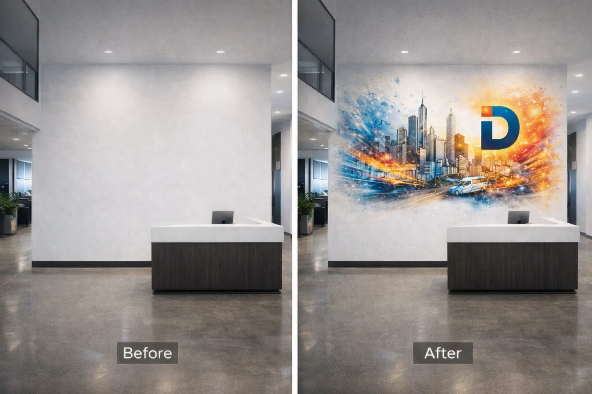
Image 2
Quick checklist for clean output and efficient handoff:
Work 1:1 when feasible; otherwise, label scale and final dimensions.
Vector: AI/PDF/SVG, outlines converted, strokes reviewed at final size.
Raster: 16-bit TIFF/PSD preferred, minimal compression, embedded color profile.
Color: Use a consistent RGB or CMYK profile as specified; request printer ICC guidance.
Composition: Keep critical content 1–2 inches from edges; allow extra image beyond edges to accommodate site tolerances.
EastCoast MuralPros provides direct to wall printing that renders both vector and raster with photoreal precision at architectural scale—without vinyl or adhesives. Our team preflights your digital art for murals, confirms mural file specifications, and can test-print on actual surfaces to validate color and detail. For multi-location rollouts and timelines that can’t slip, we help you choose the safest format strategy and deliver fast, consistent results in the field.
Color Management and Profile Standards for Consistent Physical Output
Color control is the difference between a striking brand environment and an expensive mismatch—especially in large scale wall printing where surface, viewing distance, and lighting all shift perceived color. Build your workflow around ICC-managed assets and device profiles so the art you approve on screen maps predictably to direct to wall printing on drywall, CMU, concrete, and brick.
Start with well-tagged source files. Create digital art for murals in a wide-gamut RGB space (Adobe RGB or Display P3) and always embed the profile. Avoid untagged or legacy sRGB exports unless required by your pipeline. Keep gradients 16-bit where possible to minimize banding that becomes obvious at architectural scale.
Let the printer’s RIP handle CMYK conversion using a current device profile rather than converting to generic CMYK in the design stage. Provide brand colors as LAB targets alongside any Pantone callouts; LAB preserves intent during gamut mapping. Set realistic tolerances (e.g., ≤ ΔE 2–3 for critical brand hues, slightly higher on textured masonry) and note priorities if trade-offs are required.
Soft-proof against the vendor’s ICC to anticipate gamut compression. For most commercial interior branding graphics, Relative Colorimetric with Black Point Compensation holds neutrals and logos well; use Perceptual for photographic murals with saturated foliage, skies, or skin tones. If a vivid brand red clips, share both the preferred LAB and an approved fallback swatch to guide rendering intent.
Remember the wall is part of the color system. Substrate brightness, surface texture, and site lighting (3000K hospitality vs 4000K workplace) can shift outcomes via metamerism. If walls aren’t a bright, uniform white, request guidance on an underbase or pre-coat and approve on-wall swatches before full production.
Color handoff checklist for high resolution wall graphics and mural file specifications:
Embed ICC profiles in all assets and supply a PDF/X reference proof.
Provide LAB values and Pantone notes for critical colors.
Share ambient lighting specs (CCT/CRI) and wall paint/finish details.
Request vendor ICCs for soft-proofing and an on-wall strike for key areas.
EastCoast MuralPros standardizes color across multi-location rollouts with calibrated, ICC-based workflows, on-site test swatches, and substrate-specific profiling. Their process helps brands achieve consistent, high-fidelity results in direct to wall printing without adhesives, even when campuses or retail sites vary in surfaces and lighting.
Optimizing Digital Assets for Seam-Free and Adhesive-Free Application
Start with an accurate wall survey. Capture exact width/height, surface type (drywall, CMU, concrete, brick), photos with a tape for scale, and note obstructions, reveals, and expansion joints. Build your artboard at full size (or a clear scale) with a grid or datum so elements align to architectural features. Plan a 1–2 inch safety inset from outside edges and a buffer around outlets, thermostats, and signage mounts.
Use vector wherever possible and reserve raster only for photography or textures. For high resolution wall graphics viewed within arm’s length (lobbies, patient rooms), target 180–220 ppi at final size; for corridors and open offices, 120–150 ppi is typically sufficient for crisp results in large scale wall printing. Avoid ultra-fine hairlines or micro-details that can disappear on textured substrates.
Baseline mural file specifications EastCoast MuralPros commonly supports:
Formats: PDF/X-4 (preferred), AI, layered PSD/PSB, or flattened TIFF
Color: Embed source profiles (sRGB or Adobe RGB); keep spot/Pantone where brand-critical
Resolution: 120–220 ppi at final size (per viewing distance); use PSB for very large rasters
Type/logos: Vectorized; outline fonts or include packaged fonts; minimum stroke 2 pt at final size
Margins: 1–2 inch safety from edges and penetrations; extend patterns behind fixtures when possible
Links/effects: Embed or package all links; expand complex effects or rasterize transparencies
Color management is surface-dependent in direct to wall printing. Wall color and porosity influence perceived hue and saturation, so keep files in a wide-gamut RGB with embedded ICC and let the RIP handle conversion. For brand-critical hues, supply Pantone references and request on-wall swatches; slight adjustments to builds can compensate for substrate warmth or ambient lighting.
Design for seam-free continuity. Avoid small white type reversed out of dark fields on rough CMU. Limit tight repeating patterns that can telegraph repeats; use larger tiles and randomized noise. For legibility, a practical rule is roughly 1 inch of letter height for every 10 feet of viewing distance—add 25–50% on textured walls.

Image 3
EastCoast MuralPros provides preflight templates, wall survey checklists, and on-site test prints to validate mural file specifications before production. Their direct to wall printing eliminates panel seams and adhesives, reduces install time, and keeps commercial interior branding graphics consistent across multi-location rollouts. Engage their team early to scale digital art for murals with confidence and schedule certainty.
Technical Checklist for Exporting Production-Ready Art Files
Getting your artwork export-ready is the fastest way to de‑risk large scale wall printing and keep schedules on track. Establish the finished dimensions early, confirm viewing distances, and align on color expectations before you export. EastCoast MuralPros shares project-specific mural file specifications, ICC profiles, and template guides on request, which helps avoid guesswork and costly rework.
Use this technical checklist before you hand off digital art for murals and commercial interior branding graphics:
Size and scale: Build at 1:1 when possible; if not, supply a clear scale (e.g., 1:10). Add 2–4 inches of bleed beyond the finished print area and keep critical content at least 2 inches inside edges and architectural breaks.
Resolution: Set raster elements to 150 ppi at final size for most interiors; use 200 ppi where guests will stand within a few feet. Keep logos, type, and line art as vector; avoid line weights under 2 pt at final size on textured walls.
Color management: Convert to CMYK using the provider’s ICC profile; embed the profile in your export. Call out Pantone spot colors where brand-critical, and use provider-recommended rich black for large dark fields.
File formats: Deliver a press-ready PDF (PDF/X‑4 preferred) with fonts outlined or embedded; include native AI/PSD for complex edits. Flatten or expand effects that may rasterize unpredictably (glows, overprints, knockouts).
Preflight: Remove unused layers, swatches, and hidden objects; relink or embed all imagery. Check for transparency issues, overprint warnings, total ink limits, and minimum image resolution at final scale.
Account for the surface and environment. Highly textured CMU, brick, or unfinished concrete can soften ultra-fine detail; favor bolder strokes and higher contrast. Provide a marked elevation PDF noting outlets, strobes, signage, and baseboard heights so installers can align the print area and avoid placing critical elements over obstructions.
Package the full handoff with versioned filenames, a reduced-size proof PDF, and labeled site photos. If color is mission-critical, request a small on-site swatch print to validate brand tones under actual lighting. With direct to wall printing, EastCoast MuralPros can preflight files, run quick test patches, and deliver seam-free, high resolution wall graphics with minimal disruption across single sites or national rollouts.
For ongoing seasonal refreshes or campus-wide systems, maintain layered masters, linked smart objects, and documented styles. EastCoast MuralPros’ collaborative workflow helps digital teams scale content updates quickly without compromising fidelity.
Conclusion: Enhancing Commercial Environments Through Precise Digital Preparation
Thoughtful digital prep is the difference between an impressive concept and a flawless install. When files are built for architectural scale from the start, large scale wall printing delivers predictable color, crisp detail, and a faster schedule with fewer change orders. This is especially true with direct to wall printing, where high resolution wall graphics are produced in situ without vinyl seams or adhesives that can fail over time.
Right-size your assets before you scale. Aim for an effective 100–200 ppi at full size based on viewing distance; reserve 150–200 ppi for close-view hallways and 75–100 ppi for atriums. Keep logos, typography, and line work as vector wherever possible to prevent stair-stepping—think a university arena sponsor wall at 80 feet wide where vector marks remain razor-sharp. For photographic digital art for murals, start with the highest native resolution available and avoid AI upscaling artifacts that can bloom under architectural lighting.
Architectural context should guide mural file specifications. Work from measured elevations and add non-printing layers that mark doors, fire strobes, thermostats, and signage to place safe zones and bleed. Account for texture: on brick or CMU, increase contrast and sharpen selectively so edges read at distance; on smooth drywall, softer gradients hold beautifully. Print a small on-site swatch to validate color and density before full production—e.g., a healthcare corridor wayfinding panel where a 3–5% midtone lift keeps icons legible under cool LEDs.
A quick preflight checklist helps teams move from proof to print with confidence:
Full-scale dimensions, orientation, and paneling assumptions (even for seam-free output)
Effective ppi verified at final size; vector logos and outlined fonts
Bleed of 0.5–1.0 inch and clearly defined safe areas around devices
Color management: embedded ICC profile, Pantone conversions, black builds specified
Approved file formats (PDF/X-4, layered PSD, or TIFF), with linked assets resolved
Layer notes for installers and obstruction masks on a separate layer
Version control and naming aligned to room numbers and wall IDs
For multi-site commercial interior branding graphics, build a master system: standardized grids, color tokens, and artwork modules that scale from lobby features to patient-room signage without redesign. This approach reduces file churn, shortens approvals, and ensures a consistent experience across campuses, clinics, or retail fleets.
EastCoast MuralPros can close the loop between design intent and field execution. The team reviews files against project constraints, provides surface-specific templates and test swatches, and calibrates on site so direct to wall printing lands exactly as approved—often in under five hours per area. Their process supports full-campus rollouts, subscription refreshes, and collaboration with digital artists to scale artwork across drywall, CMU, concrete, or brick. The result: durable, cleanable, paint-over-ready installations that outperform vinyl while protecting budgets, schedules, and brand integrity.
